This year’s houses were built right by the ocean in Virginia Beach and BOY did they have nice views.
I just love built-ins. There is just something so homey and classy about them. Even better, this built-in is right at the stair landing, making it perfect for a space-saving library or office (if you replaced the bench for a desk and slide in chair). How clever!
What was more clever was the uses of this old stain glass window in the hallway (sorry this is the best photo I got of it Q.Q) to add the feeling of a window in a space that might feel too constricted or otherwise wouldn't be possible structurally. I think it adds a feeling of an extension to the space or "breathing" room.
You could even add lighting behind it to cause the feeling of sunlight!
I super fell in love with this tile. It’s a little blurry of a photo but it has the texture or wood or burlap with the smoothness of sandstone! Sometimes it’s the small things that get me excited. Ha-ha.
Hubby wasn't quite a fan of this idea but I just LOVE the cohesive look these books have thanks to a simple DIY slipcover curtsy of simple paper. I also think they would look great with brown baker’s paper or making a statement with some bright, bold, printed, craft paper.
I found this rather clever. I'm sure it’s been done before but how beachy chic is this! These were tying back a bath curtain but it would be just as cute in a room to add that little vibe without overdoing it I think.
THIS is how you work in a loud color. I love how they kept it simple with the white and didn't overdo it with the accent colors. It keeps the whole room feeling lights and breezy without feeling dizzy. Note to self, WHITE IS O.K... lol
I wasn't actually a big fan of the chair itself but there is just something clever about using an old cane chair, adding a cute burlap (cheap) cushion, and some paint. BAM, awesome.Here's a closer look at that amazing texture. This pulls my heartstrings. <3
This table was one solid HUGE slab-oh-wood; it also had a $4,000 dollar price tag. But, how great would this be to DIY with some distressed planks instead, for the cheeps?!
(Sorry for all the blurry photos... not having a photo editor on our apartment’s office computer is really getting to me) Though my Darling was not a fan, I loved this wall to wall rag rug. Even better, you can make the same look by sewing together like-colored rag rugs to make one giant one. This one was big enough to fit wall to fall under a queen size bed!If anyone knows where to get this mirror, I NEED IT IN MY LIFE! that's it...
And this one too. I actually really like this photo even unedited. Something about the lighting and the white on white. I could do without the "this way" sign though. :P
This vase is amazing. I had to share. No little tidbits. Just love.
I actually really like this photo too. Even more, I love the floor to ceiling scalped tile. It almost reads as wallpaper but classier. It says "beachy" without overwhelming this small half bath. The frame-less, curvy mirror help to make things feel light also.
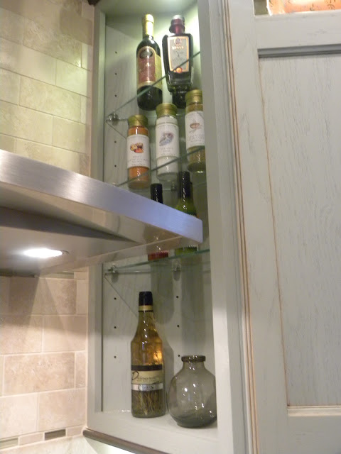
This was such a clever idea. I'm not sure how accessible it would be, but using the space on the side of the hood range, instead of just blocking it off, is so genius to me. I'm sure it’s been done before but how cool is that?!
Well, that's it for now. I hope you all enjoyed the mini-tour.


No comments:
Post a Comment